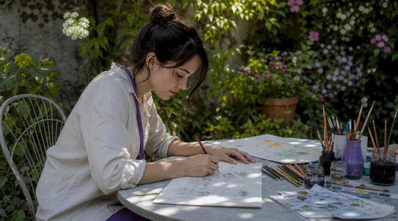
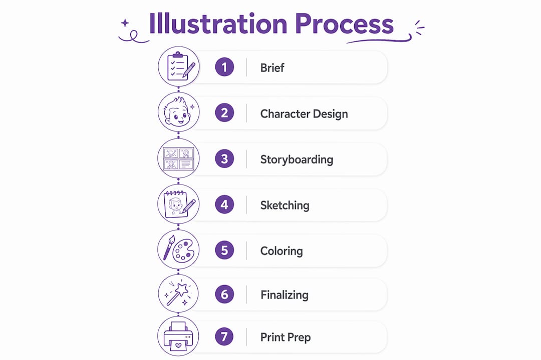
The step by step book illustration process is a multi-phase workflow that transforms a manuscript into a print-ready children's book through defined creative and technical stages. In professional practice, this workflow is called the illustration production pipeline, and it typically spans 10 to 12 distinct stages across a 3 to 6 month timeline. Tools like Procreate, Adobe Photoshop, and Adobe InDesign are the industry standard at each phase. A standard 32-page picture book requires that kind of structured commitment, and skipping any stage costs you time, money, and visual coherence in the final product.
What are the essential preparatory steps before drawing?
Preparation is the stage most beginners skip, and it is exactly where most projects fall apart. Before you draw a single line, you need to fully understand the manuscript and build a clear visual brief.
Start with a thorough manuscript breakdown. Read the text multiple times and identify every scene, emotional beat, and character moment that needs visual support. Mark which moments carry the most narrative weight. These become your priority spreads. Then map out which pages need full bleeds, which need smaller vignettes, and where text will sit within the composition.
A detailed, documented brief covering scope, mood, and emotional beats significantly reduces costly mid-project direction changes. This means writing down your style direction, color mood, and the emotional tone of the book before you open any software. If you are working with an author or publisher, this document becomes the agreement that keeps everyone aligned.
Building a mood board is the next concrete step. Collect reference images for:
- Color palettes that match the book's emotional tone
- Illustration styles that align with your vision (flat graphic, painterly, textured)
- Lighting references for indoor and outdoor scenes
- Typography samples to understand how text will coexist with art
Pro Tip: Write your brief as a formal document, even if you are the sole illustrator. Mid-project, when you are deep in spread 18 and second-guessing your color choices, that document is the anchor that keeps you consistent.
A children's book illustration guide reinforces that defining scope upfront is not bureaucratic overhead. It is the single most effective way to protect your creative vision and your schedule.
How to develop and finalize characters before illustrating pages?
Character design is the visual heart of any children's book. Every other illustration decision flows from who your characters are and how they look on the page.
Follow this sequence to build characters that hold up across every spread:
- Sketch multiple variations. Draw your main character in at least 5 to 8 different interpretations before committing to one. Vary the face shape, proportions, hair, and clothing. This forces you to explore rather than default to your first instinct.
- Select and refine the final design. Choose the version that best fits the book's tone and is simple enough to redraw consistently at different sizes and angles.
- Build a full character sheet. This is non-negotiable. Character sheets with front, side, and three-quarter views plus expression studies prevent the common problem of character drift, where your character looks noticeably different by spread 20 compared to spread 3.
- Add a color reference panel. Document every color used on the character with exact hex codes or Pantone references. This is your master palette.
- Test the character in context. Place the finalized character into a rough background to confirm scale, contrast, and readability at picture book size.
Character drift is one of the most common and damaging mistakes in children's book illustration. A child reading the book will notice immediately if the main character's eyes change shape or their hair shifts color between pages. Consistency is not a stylistic preference. It is a technical requirement.
Pro Tip: Every 5 spreads, overlay your current character drawing against the character sheet using a digital layer at 50% opacity. Any drift shows up immediately before it compounds across the whole book.
Why is storyboarding and thumbnail sketching critical and how is it done?
Visual storytelling and pacing matter more than isolated cute images. The storyboard is the architectural blueprint of the book, and skipping it leads to poorly paced or confusing books and costly revisions later.
Thumbnail sketches are small, rough drawings, typically about 2 by 3 inches, that map out every page or spread in the book. They are not meant to be pretty. They are meant to be fast and functional.
Here is what strong thumbnails accomplish:
- Pacing control. You can see at a glance whether you have five consecutive spreads with the same camera angle. Variety in viewpoint, from close-ups to wide establishing shots, keeps the reader visually engaged.
- Page-turn anticipation. The moment before a page turn should create curiosity or tension. Thumbnails let you plan those beats deliberately.
- Text area planning. The artwork must include text-friendly zones planned in advance. Negative space in skies or soft foreground areas creates room for text placement without covering key visual elements.
- Composition variety. A spread with a character centered in every image reads as flat and repetitive. Thumbnails reveal that problem before you invest hours in final art.
Here is a quick comparison of what storyboarding catches versus what gets missed without it:
| With storyboarding | Without storyboarding |
|---|---|
| Pacing issues caught at sketch stage | Pacing problems discovered after final art is complete |
| Text areas planned into composition | Text covers key illustration elements |
| Visual variety confirmed across spreads | Repetitive angles and compositions |
| Page-turn moments designed intentionally | Flat narrative flow with no anticipation |
Pro Tip: Pin all your thumbnails to a physical wall or use a digital board like Milanote to view the entire book at once. Auditing the flow as a whole sequence reveals problems that are invisible when you review spreads one at a time.
What are the steps in creating final sketches and full-color illustrations?
This is where the project shifts from planning to production, and it is also where 60 to 70 percent of the total project timeline gets consumed. A single full-spread illustration takes 8 to 12 hours including color correction and soft-proofing. That number is not a warning. It is a planning tool.
Work through final art in this sequence:
- Develop full-size rough sketches. Scale up from your thumbnails to the actual print dimensions. Refine composition, character placement, and background detail. This is still a sketch, but it should be detailed enough for someone else to understand the full scene.
- Get approval before coloring. If you are working with an author, publisher, or client, this is the checkpoint. Changes at the sketch stage take 30 minutes. Changes after final color can take days.
- Apply flat color roughs. Block in the base colors across the entire spread before adding any detail. This confirms your palette works and that the color temperature reads correctly.
- Build up detail and texture. Add lighting, shadows, texture, and fine character details. Many illustrators use a combination of traditional and digital workflows, scanning hand-drawn textures and finishing digitally in Photoshop or Procreate for maximum flexibility.
- Run a color consistency check. Compare each finished spread against your master character sheet and palette reference. Color consistency across all spreads is challenging but critical. A jarring color shift between spreads breaks the reader's immersion.
Pro Tip: Save your final artwork in layered PSD or Procreate files, not flattened exports. When the layout designer needs to shift a character slightly to accommodate a text edit, layered files make that a 10-minute fix instead of a full redraw.
How to prepare final files for print and avoid common technical pitfalls?
Print file preparation is where technically strong projects succeed and where underprepared ones fail at the last step. Working at 300 DPI and final print dimensions from the start avoids pixelation issues that are common in self-published books. If you set up your canvas at 72 DPI and try to upscale later, the damage is permanent.
The technical requirements for print-ready files are:
- Resolution: 300 DPI minimum at final print size
- Bleed: 0.125 inches on all sides to prevent white edges after trimming
- Color mode: CMYK or soft-proofed for CMYK output using Photoshop's soft-proofing feature
- File naming: Consistent, sequential naming (e.g., spread_01_final.psd) to prevent layout errors
- Layers: Flatten layers for final export files while keeping layered originals as backups
Soft-proofing in Photoshop is an essential technical step to simulate CMYK color reproduction and catch potential color issues early. RGB colors on screen often look richer and more saturated than they will appear in print. Running a soft-proof simulation before exporting shows you exactly where colors will shift, so you can correct them before the file goes to the printer.
Text integration happens in Adobe InDesign, where you assemble all spreads, place the typography, and check that text sits cleanly within the zones you planned during storyboarding. This is also where you confirm that physical or digital proofs are reviewed for color accuracy and text errors before the final print run.
Pro Tip: Plan your text-friendly zones during the storyboard stage, not the layout stage. Trying to retrofit text into a finished illustration that has no negative space is one of the most common and avoidable sources of last-minute rework.
Key takeaways
The step by step book illustration process succeeds when preparation, character consistency, storyboarding, and print-ready technical standards are treated as equally important stages, not optional extras.
| Point | Details |
|---|---|
| Brief before drawing | A documented brief covering scope, mood, and text placement prevents costly mid-project changes. |
| Character sheets are non-negotiable | Front, side, and three-quarter views with a master color palette prevent character drift across spreads. |
| Storyboard as blueprint | Thumbnail sketches at 2x3 inches reveal pacing, text conflicts, and composition variety before final art begins. |
| 300 DPI from day one | Setting up canvas at print resolution and dimensions from the start avoids pixelation in the final product. |
| Soft-proof before export | Photoshop soft-proofing simulates CMYK output and catches color shifts before files go to the printer. |
What I have learned from working through the illustration pipeline
The storyboard stage is the one most beginners rush, and it is the one that costs the most when skipped. I have seen projects where the final art was genuinely beautiful, spread by spread, but the book as a whole felt flat because no one had audited the pacing. The page turns had no tension. The camera angle never changed. The reader's eye had nowhere interesting to go. All of that is visible in thumbnails at 2 by 3 inches. None of it is fixable after 200 hours of final art.
Character consistency is the other area where the gap between knowing and doing is wide. You can understand intellectually that a character sheet matters. But sitting down to draw 12 expression studies and 4 angle variations before you have drawn a single page of the actual book feels like delay. It is not. It is the work that makes the rest of the work possible.
The thing I find most honest to say about the illustration workflow is that the creative and technical sides are not in tension. They support each other. Working at 300 DPI does not constrain your art. Planning text zones does not limit your composition. These constraints are the structure that lets the creative decisions land correctly. The illustrators who treat technical prep as a separate, lesser task are the ones who end up redrawing spreads at the end of a six-month project.
If you are combining traditional and digital methods, lean into that. Scanned pencil texture under digital color gives you something that pure digital often lacks. The flexibility of digital editing with the warmth of hand-drawn line work is a combination worth the extra steps.
— Jason
How Adventuresofbook approaches personalized children's book illustration
If you are an aspiring illustrator studying this workflow, it is worth seeing how AI-driven platforms handle the same production challenges at scale. Adventuresofbook generates original children's storybooks from uploaded photos of a real child, producing 13 illustrated pages as an 8.5x8.5 print-ready PDF in about five minutes. The illustrations are built from the child's actual likeness, not a generic template character with a name swapped in.
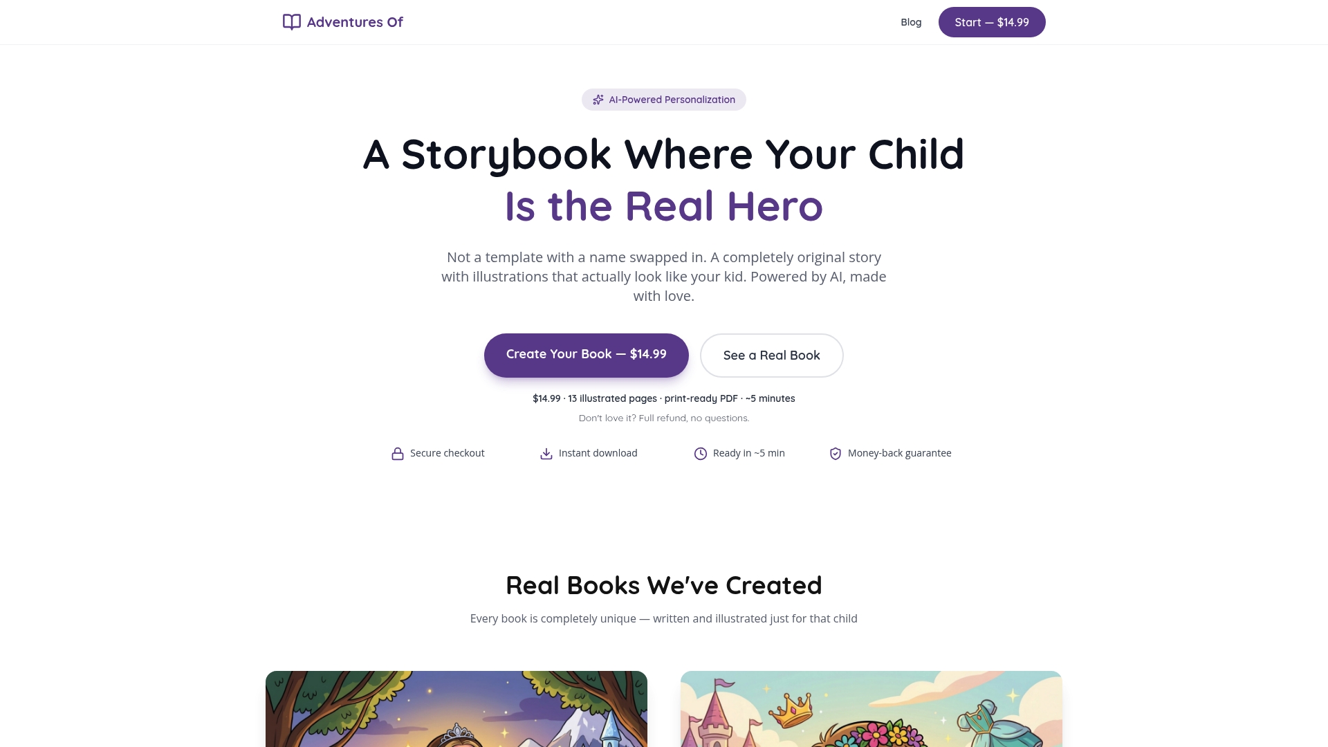
The result is a personalized storybook where the child is the actual visual hero of the story, with original illustrations and an original narrative generated for that specific child. For parents looking for a meaningful, print-ready book without a six-month production timeline, it is a genuinely different product from what traditional publishing offers. You can explore the full library of book styles at Adventuresofbook or start creating directly at adventuresofbook.com/create for $14.99 with a 7-day refund guarantee.
FAQ
How long does the book illustration process take?
A professional 32-page children's picture book typically takes 3 to 6 months from manuscript to print-ready files, with final artwork consuming 60 to 70 percent of that timeline.
What resolution should children's book illustrations be?
All final artwork should be set up at 300 DPI at actual print dimensions from the start. Upscaling lower-resolution files later causes permanent pixelation that no software can fully correct.
Why do illustrators use character sheets?
Character sheets with front, side, and three-quarter views prevent character drift, the gradual inconsistency in how a character looks across different pages. They serve as the visual reference for every spread in the book.
What is soft-proofing and why does it matter?
Soft-proofing in Photoshop simulates how CMYK print colors will appear, since RGB screen colors are often more saturated than what a printer can reproduce. Running a soft-proof before exporting catches color shifts before they reach the final printed copy.
What is the biggest mistake beginners make in book illustration?
Most beginners underestimate the time required for pre-production stages like storyboarding and character sheet creation. Rushing these stages leads to pacing problems and character inconsistencies that are expensive and time-consuming to fix in final art.