A print-ready children's book is defined as a properly formatted digital file that meets the technical requirements of a commercial printer or print-on-demand service. Learning how to make print-ready children's books means understanding resolution, bleed margins, page counts, color space, and typography before you ever send a file to print. Services like Amazon KDP and IngramSpark enforce these standards strictly. Get them right, and your book prints cleanly. Get them wrong, and you pay for a proof that looks nothing like your screen.
What are the essential technical specifications for children's book printing?
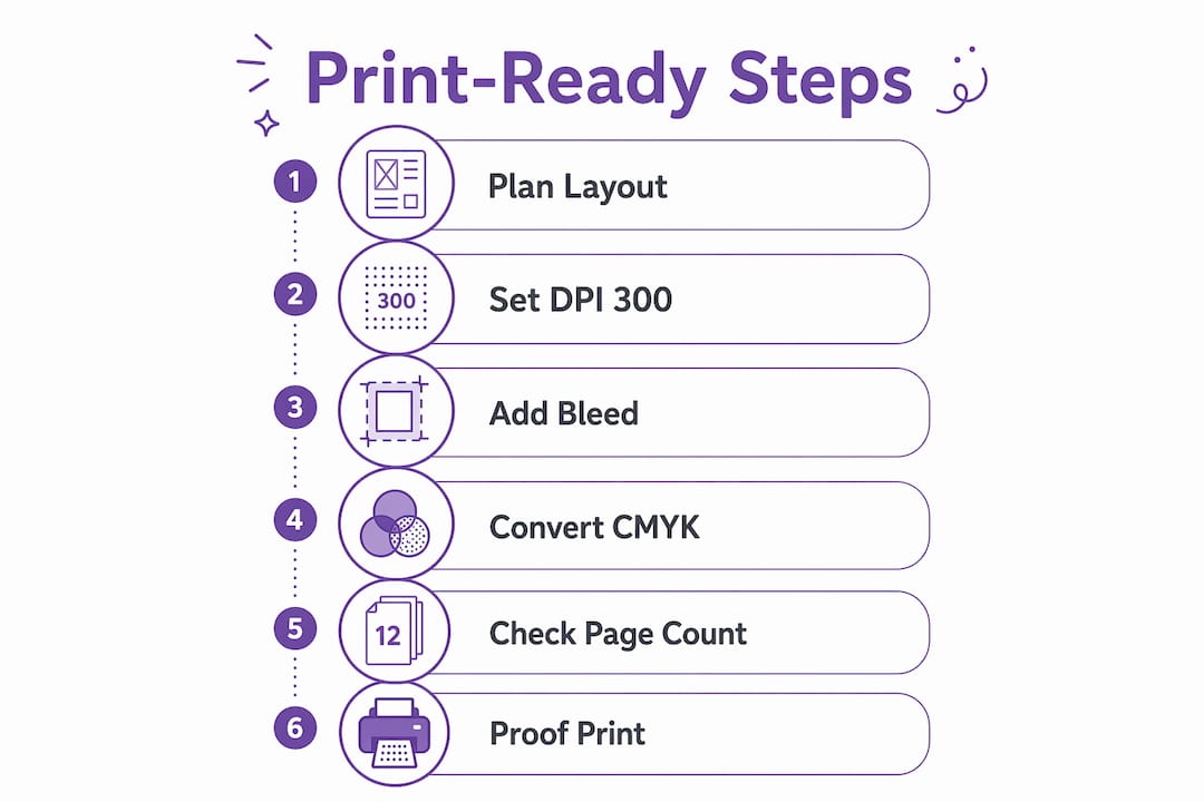
The minimum resolution for any illustration in a print-ready children's book is 300 DPI. A full-page spread at 8.5x8.5 inches requires an image of at least 2,625x2,625 pixels to hit that threshold. Anything below 300 DPI will print with visible pixelation, which is especially noticeable in large, flat color areas common in picture book art.
Bleed is the strip of artwork that extends beyond the final trim edge. Standard bleed is 0.125 inches on every side. This extra margin prevents white slivers from appearing at the page edge when the printer's cutting blade shifts slightly. Always extend background colors and full-bleed illustrations into this zone.
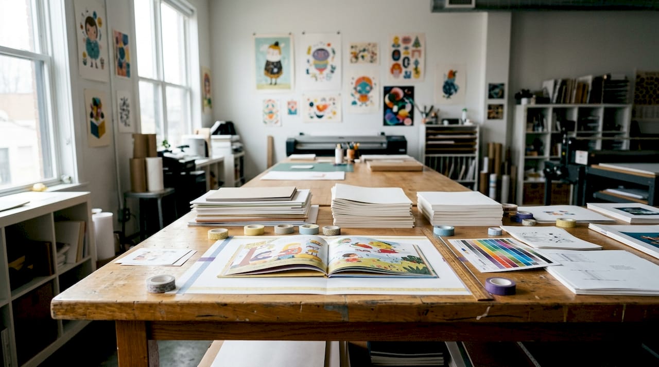
Page counts follow a strict rule. KDP and IngramSpark require multiples of 8 pages, with 24 pages as the minimum and 32 pages as the standard for picture books. That count includes front matter, back matter, and any blank pages. Plan your story structure around these numbers from the start, not after you have finished writing.
Color space matters more than most first-time authors expect. Convert files to CMYK before submitting to print, even if your POD service accepts RGB. RGB colors can shift significantly when converted by the printer's software, turning bright yellows muddy and vivid blues flat. Designing in CMYK from the beginning gives you control over the final result.
Here is a quick reference for the core specs:
| Specification | Standard Requirement |
|---|---|
| Image resolution | 300 DPI minimum |
| Bleed margin | 0.125 inches on all sides |
| Trim size (square) | 8.5x8.5 inches (common for picture books) |
| Page count | Multiples of 8; 32 pages standard |
| Color space | CMYK for print accuracy |
| Safe margin (text) | 0.25 inches from trim edge |
Pro Tip: Set up your document with bleed and safe margins before you place a single illustration. Fixing them after the artwork is placed costs hours.
How should text and illustrations be formatted inside a children's book?
Text-to-image ratio is one of the most overlooked decisions in children's book formatting. Picture books for ages 3–7 should keep text under 20% of each page spread. That means illustrations carry the story. Your words set the scene; the art tells the rest.
Typography choices directly affect how long a child stays engaged. Use 16–20pt type for picture books, 14–16pt for early readers, and 12–14pt for chapter books. Fonts like Gill Sans, Futura, and Comic Neue are well-suited to children's books because they are open, round, and easy to decode for new readers. Line spacing should sit at 1.5 to 2 times the font size to prevent crowding.
Gutter placement is a layout mistake that ruins otherwise beautiful books. Never place critical text or key illustration details within 0.25 inches of the binding edge. When a book is bound, the gutter pulls pages inward. Anything too close to that seam gets swallowed. This applies to both text and faces in illustrations.
Follow this sequence when laying out each spread:
- Set your document to the correct trim size with bleed and safe margins already active.
- Place the full-bleed illustration first, extending it into the bleed zone on all outer edges.
- Position text blocks inside the safe margin, at least 0.25 inches from every edge.
- Check that no character faces or key story objects fall in the gutter zone.
- Review the spread at 100% zoom to confirm text is readable without zooming in.
Pro Tip: Print a single test spread on a home printer and fold it to simulate the gutter. You will spot crowding issues in 30 seconds that you would miss on screen.
What tools and software options best support creating print-ready files?
The right software makes the difference between a file that prints cleanly and one that gets rejected. Adobe InDesign is the industry standard for book layout. It handles bleed setup, master pages, CMYK color management, and PDF export with embedded fonts in a single workflow. The learning curve is real, but the output is reliable.
Affinity Publisher is a strong alternative at a one-time cost rather than a subscription. It supports the same bleed and margin controls as InDesign and exports press-ready PDFs. Apple Pages works for simple layouts but lacks precise bleed controls, making it a weaker choice for full-bleed illustrated books.
Key setup steps apply regardless of which tool you use:
- Create a new document at your exact trim size plus bleed on all sides.
- Set safe margins at 0.25 inches from the trim edge.
- Use master pages or templates to keep consistent margins across every spread.
- Embed all fonts before exporting, since missing fonts cause text to reflow or disappear.
- Export as a PDF/X-1a or PDF/X-4 file, which are the formats most POD services require.
Creating a physical dummy book before you open any software is one of the most practical steps you can take. Fold and staple blank paper to match your page count, then sketch rough thumbnails for each spread. This storyboard reveals pacing problems, text-heavy pages, and awkward page turns before you spend hours in layout software.
Working with an illustrator adds another layer of coordination. Provide your illustrator with a spec sheet that lists the exact pixel dimensions, color space, and bleed requirements. Receiving files in the wrong color space or at 72 DPI after the artwork is finished is a common and costly problem.
How do you avoid common mistakes when preparing a print-ready children's book?
Low image resolution is the most frequent error in self-published children's books. An illustration that looks sharp on a monitor at 72 DPI will print blurry at full size. Always request source files from illustrators at 300 DPI in the final print dimensions, not scaled up from a smaller file.
Incorrect bleed settings cause white edges at the trim line. If your background color stops at the trim edge rather than extending 0.125 inches beyond it, the printer's cutting tolerance will expose a white sliver. Check every page individually, not just the first spread.
Color shifts from RGB to CMYK catch many authors off guard. A bright red designed in RGB can print as a dull brick tone after conversion. Designing in CMYK from the start prevents this. If you receive RGB artwork from an illustrator, convert it in Photoshop and do a soft proof before finalizing the file.
"Digital previews can miss problems that only appear in physical proofs. Ordering a proof copy before mass printing is the single most reliable way to catch color, alignment, and bleed errors that screens hide."
Gutter misalignment is another issue that only becomes visible in a bound copy. Text that reads fine as a flat PDF can disappear into the spine when the book is glued. Order at least one physical proof from your POD service before approving a print run. The cost is small compared to reprinting a full batch.
Key Takeaways
Creating print-ready children's books requires correct resolution, bleed, page count, CMYK color space, and age-appropriate typography before any file goes to a printer.
| Point | Details |
|---|---|
| Resolution and bleed | Set all illustrations to 300 DPI and extend artwork 0.125 inches beyond the trim edge. |
| Page count rule | Use multiples of 8 pages; 32 pages is the standard for picture books on KDP and IngramSpark. |
| Typography by age | Use 16–20pt fonts for picture books and keep line spacing at 1.5–2x the font size. |
| Color space | Design in CMYK from the start to prevent color shifts during printing. |
| Proof before printing | Order a physical proof copy to catch errors that digital previews consistently miss. |
What I have learned from watching authors skip the basics
I have seen authors spend months on beautiful illustrations and then submit a file with 72 DPI artwork and no bleed. The book comes back looking like a photocopy. The specs are not bureaucratic red tape. They exist because physical printing is unforgiving in ways that screens are not.
The step most authors skip is the physical dummy. Folding paper and sketching thumbnails feels low-tech, but a storyboard exposes pacing problems that no software preview will show you. A page turn is a dramatic beat in a children's book. You cannot feel that on a monitor.
My honest advice: if layout is not your strength, hire a professional designer for the file preparation stage, even if you handle the writing and illustration yourself. A clean, well-paced layout is what separates a book that kids ask to read again from one that sits on the shelf. Authentic storytelling matters, but it has to be readable to land.
The authors who get this right treat the technical specs as part of the creative process, not an afterthought. They set up their documents correctly on day one, work in CMYK, and order a proof before they celebrate. That discipline is what produces a book worth holding.
— Jason
Personalized print-ready storybooks from Adventuresofbook
If you want a print-ready children's book without building the layout from scratch, Adventuresofbook offers a different path. Upload a photo of your child, add their name and a few details, and the AI generates an original story with illustrations that actually look like your kid. No templates, no generic characters with a name swapped in.
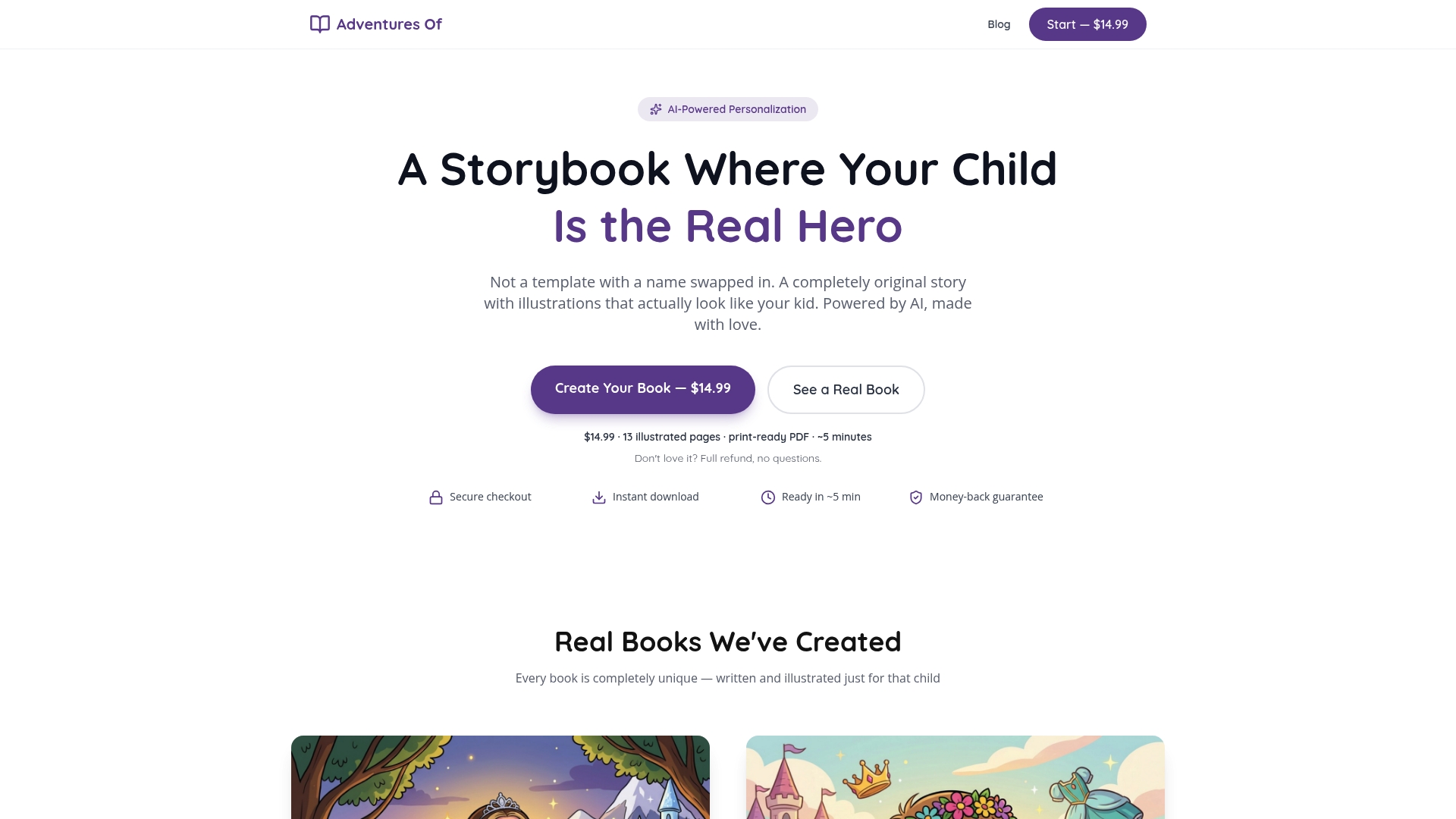
The result is a personalized children's book delivered as an 8.5x8.5 print-ready PDF with 13 illustrated pages, ready to send to a local print shop or a POD service. The whole process takes about five minutes and costs $14.99 as a one-time purchase, with a 7-day refund if you are not satisfied. For parents or educators who want a genuinely original book starring a specific child, Adventuresofbook is worth a look.
FAQ
What does "print-ready" mean for a children's book?
A print-ready file meets all technical requirements for commercial printing, including 300 DPI resolution, 0.125-inch bleed, CMYK color space, and embedded fonts. It requires no corrections from the printer before going to press.
How many pages does a children's picture book need?
Page counts must be multiples of 8, with 24 pages as the minimum and 32 pages as the standard for picture books on services like KDP and IngramSpark.
What font size should a children's book use?
Picture books for ages 3–7 use 16–20pt type, early readers use 14–16pt, and chapter books use 12–14pt, with line spacing set at 1.5 to 2 times the font size.
Why does my printed book look different from my screen?
Color shifts occur when RGB files are converted to CMYK during printing. Designing in CMYK from the start and ordering a physical proof copy before final printing prevents most color surprises.
Do I need to hire a designer to self-publish a children's book?
You do not need to, but professional layout help is worth considering if precise margin, gutter, and bleed setup falls outside your skill set. Clean layout directly affects readability and print quality.