A custom book creation checklist is a structured, step-by-step guide that ensures your personalized children's storybook is professionally crafted, print-ready, and genuinely unique. Without one, parents routinely hit the same wall: a beautiful design built on an unfinished story, or a printed book with white slivers along the edges because the bleed area was never set. Industry standards like 300 DPI image resolution, embedded fonts, and trim-and-bleed settings are not optional extras. They are the difference between a book that looks handmade and one that looks like it came from a shelf. This guide walks you through every stage of the book production process, from locking your manuscript to exporting a print-ready PDF.
1. Why you must finalize your manuscript before anything else
Designing before finalizing the manuscript is one of the most common missteps in self-publishing, and it leads directly to costly rework. Once you start placing text inside a designed layout, every story change forces a redesign. Lock the words first. Then build around them.
Writing a book step by step means treating the manuscript as its own phase. Read the story aloud from start to finish. You will catch awkward sentences, repeated words, and pacing problems that silent reading misses. Cut any scene or sentence that does not move the story forward.
Beta readers improve manuscript quality before design begins. Three to five readers with specific questions about pacing, character clarity, and age-appropriateness will surface problems you cannot see after staring at the same draft for weeks. For a children's storybook, ask a parent who does not know your child to read it. Their reaction tells you whether the story works on its own merits.
- Read the full story aloud at least twice
- Cut any sentence that does not add to the plot or character
- Ask 3–5 beta readers for feedback on pacing and clarity
- Check that character names and details stay consistent throughout
- Only move to design once the text is fully approved
Pro Tip: Print the manuscript on plain paper and mark it up with a pen. Screen editing misses things that paper catches.
2. Front matter and back matter that make your book look professional
Professional personalized storybooks include proper front matter and back matter pages. These pages are what separate a polished keepsake from a stapled printout. They signal that the creator took the project seriously.
Front matter comes before the story begins. Back matter follows the final page. Neither section needs to be long, but both need to be present.
Standard front matter for a personalized children's book:
- Half-title page: Just the book title, centered
- Full title page: Title, child's name or dedication, and illustrator credit
- Copyright page: Year, creator name, and a simple rights statement
- Dedication page: A short personal note to the child
Standard back matter to include:
- Author bio: One or two sentences about who made the book and why
- Acknowledgments: Optional, but meaningful for a gift book
- A note on the story: Explain the inspiration if the child is old enough to appreciate it
These pages add legitimacy and a polished look that elevates the book as a keepsake gift. A child who receives a book with a real dedication page and a copyright notice feels the weight of it differently than one who gets loose printed pages.
3. Key design and formatting tips for a print-ready PDF
Print-ready file standards require single-page PDFs, 300 DPI images, and fully embedded fonts. Each of these requirements exists for a specific reason, and skipping any one of them produces a visible defect in the final printed book.
Page size and margins
Set your page size before you place a single image or line of text. For a square children's book, 8.5x8.5 inches is a standard and practical choice. Set gutter margins (the inner margin near the binding) wider than the outer margins. Gutter margins prevent text from disappearing into the spine during binding.
Image resolution and bleed
Every photo or illustration must be at least 300 DPI at its final print size. Scaling a low-resolution image up in your layout software does not increase its DPI. It just makes the pixels larger and blurrier. Extend all background colors and images into the bleed area, typically 0.125 inches beyond the trim line. "White slivers" on book edges appear when designers fail to extend backgrounds into bleed areas. That thin white line along the edge of a printed page is one of the clearest signs of an amateur file.
Fonts and export
Embed all fonts fully before exporting your PDF. Font substitution happens when a printer's system replaces your chosen font with a default because the original was not embedded. The result looks nothing like your design. Flatten all layers in your layout file before export to prevent transparency rendering issues.
- Page size: 8.5x8.5 inches (or your chosen trim size)
- Gutter margin: wider than outer margin to protect text from binding
- Image resolution: 300 DPI minimum at final print size
- Bleed: extend backgrounds 0.125 inches beyond trim line
- Fonts: fully embedded in the exported PDF
- Layers: flattened before export
Pro Tip: Export a low-resolution proof PDF first and zoom in to 100% on screen. If images look soft at that zoom level, they will print soft.
Print PDFs and ebook files are fundamentally different formats. A fixed-layout print PDF does not translate to a readable ebook. If you plan to offer both, build them separately from the start.
4. Realistic timelines and pitfalls to avoid
The book production process from finished manuscript to print-ready product typically takes 4–12 weeks depending on complexity. That range breaks down roughly as 1–2 weeks for final polishing, 2–8 weeks for editing and revision, and 1–2 weeks for formatting and export. For a personalized children's storybook, you can compress this significantly if the story is short and you are doing your own design work.
The most common pitfalls parents hit during this process:
- Starting design before the story is locked. Every text change after layout is set costs time and risks introducing new errors.
- Skipping proofreading on the final PDF. Formatting errors, widowed words, and font substitutions only show up in the exported file.
- Ignoring gutter margins. Text placed too close to the inner edge gets swallowed by the binding.
- Using low-resolution photos. A child's face printed at 72 DPI looks blurry and flat. Always source the highest-resolution photo available.
- Treating the cover as an afterthought. The cover is the first thing a child sees. Design it with the same care as the interior.
Over 3.5 million books were self-published in the US in 2025. That volume means print-on-demand services have seen every possible file error. The ones that cause the most delays are missing bleeds, unembedded fonts, and incorrect color profiles.
For parents who want to skip the 4–12 week timeline entirely, Adventuresofbook generates an AI-driven story and custom illustrations from a child's photos in about 5 minutes. That is a genuinely different category of product, not a shortcut through the same process.
5. Building a cohesive theme and visual identity for your book
Branding early using a consistent theme, font, and tone creates a package that feels store-bought. For a personalized gift book, "branding" just means making deliberate choices and sticking to them. Pick one font family for all text. Pick a color palette that matches the child's personality or the story's mood. Apply both consistently from the cover to the final page.
The visual theme should connect to the child's actual interests. A book about a child who loves space should use deep blues, star shapes, and a bold display font. A book about a child who loves animals works better with warm earth tones and a rounded, friendly typeface. These choices are not decorative. They tell the child that this book was made specifically for them.
Tone matters as much as visuals. A story for a two-year-old uses short sentences, simple vocabulary, and repetition. A story for a six-year-old can carry a real plot with a beginning, middle, and end. Mixing tones within a single book confuses young readers and breaks the reading experience.
- Choose one font family and use it for all text elements
- Select a color palette of 3–4 colors and apply it throughout
- Match the visual style to the child's age and interests
- Keep sentence length and vocabulary consistent with the target age
- Use the child's real photo as the basis for illustrations where possible
Pro Tip: Look at three or four picture books your child already loves. Write down what their covers have in common. That is your visual brief.
Adventuresofbook builds this consistency directly into its process. The AI generates illustrations that resemble the specific child based on uploaded photos, so the visual identity of the book is grounded in something real rather than a generic character design. You can see how that approach differs from template-based options in this personalized vs. template books comparison.
Key takeaways
A complete custom book creation checklist covers manuscript, front matter, design specs, timeline, and visual theme in that order.
| Point | Details |
|---|---|
| Lock manuscript first | Finalize all story text before starting layout to avoid costly redesign. |
| Add front and back matter | Include title, copyright, dedication, and author bio for a polished, gift-worthy result. |
| Meet print-ready specs | Use 300 DPI images, embedded fonts, correct bleed, and gutter margins before export. |
| Plan for 4–12 weeks | Allow realistic time for editing, design, and proofing unless using an AI generation tool. |
| Commit to one visual theme | Choose a consistent font, color palette, and tone that match the child's age and interests. |
What I've learned from watching parents skip the checklist
The parents who end up most frustrated are not the ones who struggled with design software. They are the ones who started designing on day one. They had a beautiful layout by week two, then realized the story needed a new ending, and the whole thing fell apart. The checklist is not bureaucracy. It is the order of operations that keeps the project from collapsing on itself.
The front matter section is the one most parents skip entirely. They think it is for "real" books. But a child who opens a gift and sees a proper title page with their name, a dedication written just for them, and a copyright notice with the year feels something different. The book feels official. That feeling is the whole point of making a personalized book in the first place.
The technical specs are the part that trips up parents who are confident designers. Knowing how to use Canva or Adobe InDesign does not automatically mean you know about gutter margins or bleed areas. I have seen beautifully designed books come back from the printer with text cut off at the spine because no one set the gutter. Read the printer's file requirements before you start, not after you finish.
The most underrated step on any self-publishing checklist is the final proof read of the exported PDF. Not the design file. The actual PDF. Fonts shift, images compress, and text reflows in ways that only show up after export. Print one copy at home before you order a print run. It takes ten minutes and saves a lot of regret.
— Jason
How Adventuresofbook handles the hard parts for you
If the checklist above feels like a lot to manage alongside an actual life, that is a fair read. Adventuresofbook was built for exactly that situation.
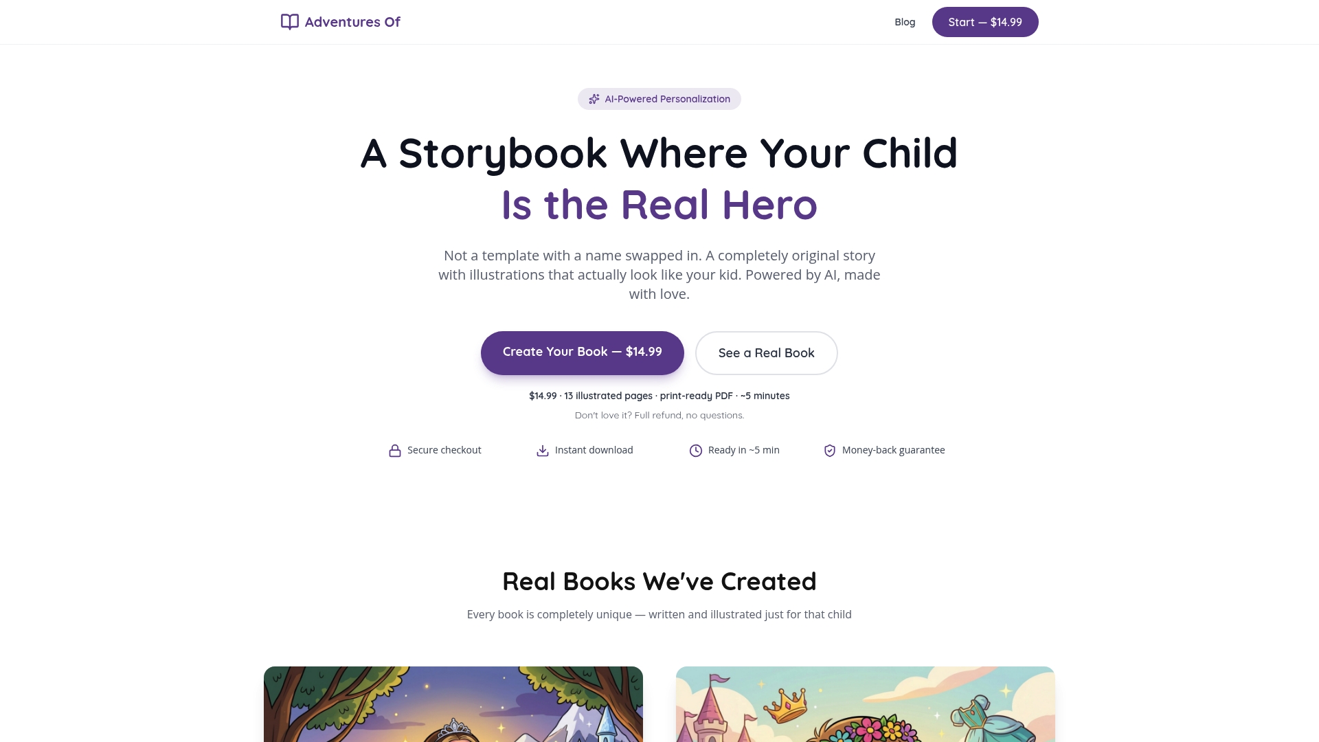
You upload a photo of your child, add their name and a few details about their personality, and the platform generates an original story with custom illustrations that actually look like your kid. Not a template with a name swapped in. The output is a print-ready personalized storybook in 8.5x8.5 format, 13 illustrated pages, exported as a PDF that meets print standards. The whole process takes about 5 minutes and costs $14.99 as a one-time purchase. A 7-day refund policy covers you if the result does not meet your expectations. For parents who want a genuinely unique gift without a 12-week production timeline, it is a direct path to something real.
FAQ
What is a custom book creation checklist?
A custom book creation checklist is a step-by-step guide covering manuscript finalization, front matter, design specs, and print-ready export requirements. It keeps the production process in the right order and prevents common errors like unembedded fonts or missing bleed areas.
What image resolution do I need for a printed children's book?
Print-ready files require images at 300 DPI or higher at their final print size. Using lower-resolution photos produces blurry, flat results in the finished book.
How long does it take to create a personalized children's book?
The book production process from finished manuscript to print-ready file typically takes 4–12 weeks when done manually. AI-driven tools like Adventuresofbook compress that to about 5 minutes for story and illustration generation.
What is a gutter margin and why does it matter?
A gutter margin is the extra space added to the inner edge of each page to prevent text from disappearing into the binding. Setting it correctly before PDF export is one of the most commonly skipped steps in children's book formatting.
Do I need separate files for print and digital versions?
Print and digital formats require separate files. A fixed-layout print PDF does not work as a reflowable ebook. Build each format from scratch using the appropriate settings for its intended reading experience.